A landing page is the grand finale of any marketing campaign bringing traffic to your website.
It’s the place where anonymous website visitors become invested in your brand, whether by registering their interest or even parting with their money.
Priming your landing page for conversions is key - it’s got to look and work flawlessly.
Landing page checklist
This useful checklist includes some of the most important components a landing page needs, as well as top optimisation tips.
It's perfect for building brand new pages or for upgrading underperforming ones.
After all, you don’t want your marketing campaign to fall at the final hurdle.
Top tips for every landing page:
- Keep it visual
- Make sure it works well on mobile
- Include different types of media (eg. videos, graphics and pictures)
- Stay focused on encouraging users to convert
- Make sure the landing page is an extension of your marketing campaign by using the same branding, so people remain confident that it’s the same offering.
What to include at the top of a landing page
It’s no secret that people’s online attention spans suck, so you only have seconds to grab their focus.
Eye-catching header
Upon arriving at your landing page it should be crystal clear to them what you offer and be on-brand with the marketing campaign that brought them there.
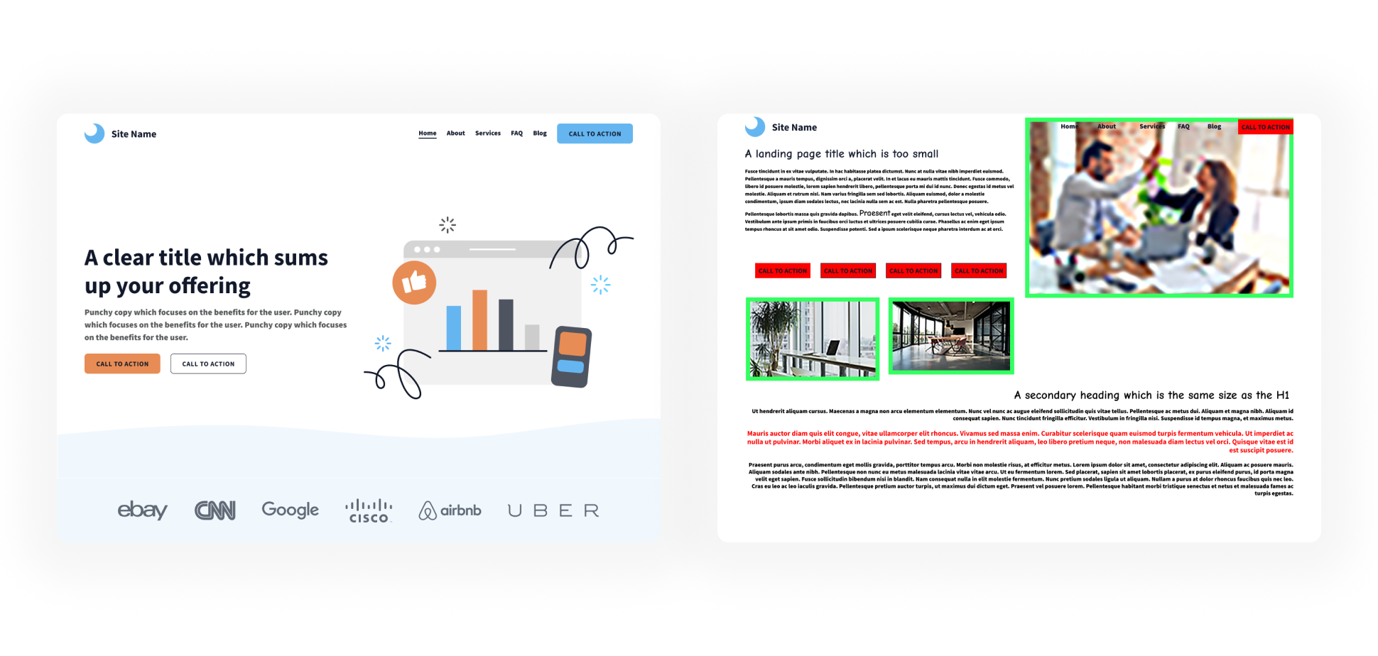
The good example header (on the left) is clear and appealing, whereas the bad example header (on the right) is messy, making it difficult to understand
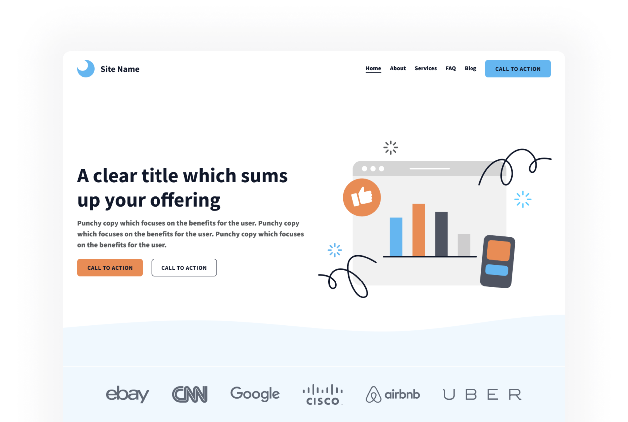
An eye-catching header needs:
- Relevant imagery of what you offer
- A clear, concise title which sums up the offering (don’t be flowery!)
- Punchy copy which focuses on the benefits for the user. It could include:
- Explanation of what you offer/do
- Who your products/services are for
- What pain points it solves
- Value proposition or ‘what’s in it for them’
- One or two buttons that lead users to other relevant pages on your website (if there isn’t an embedded form on the page, more on this below!)
Assume that a lot of people will not scroll further than the header, so you really need to hook them in here.
An easy-to-fill-in form
Preferably, the landing page will have an embedded form so you can convert users straight away. Make the form-filling process as easy as possible.
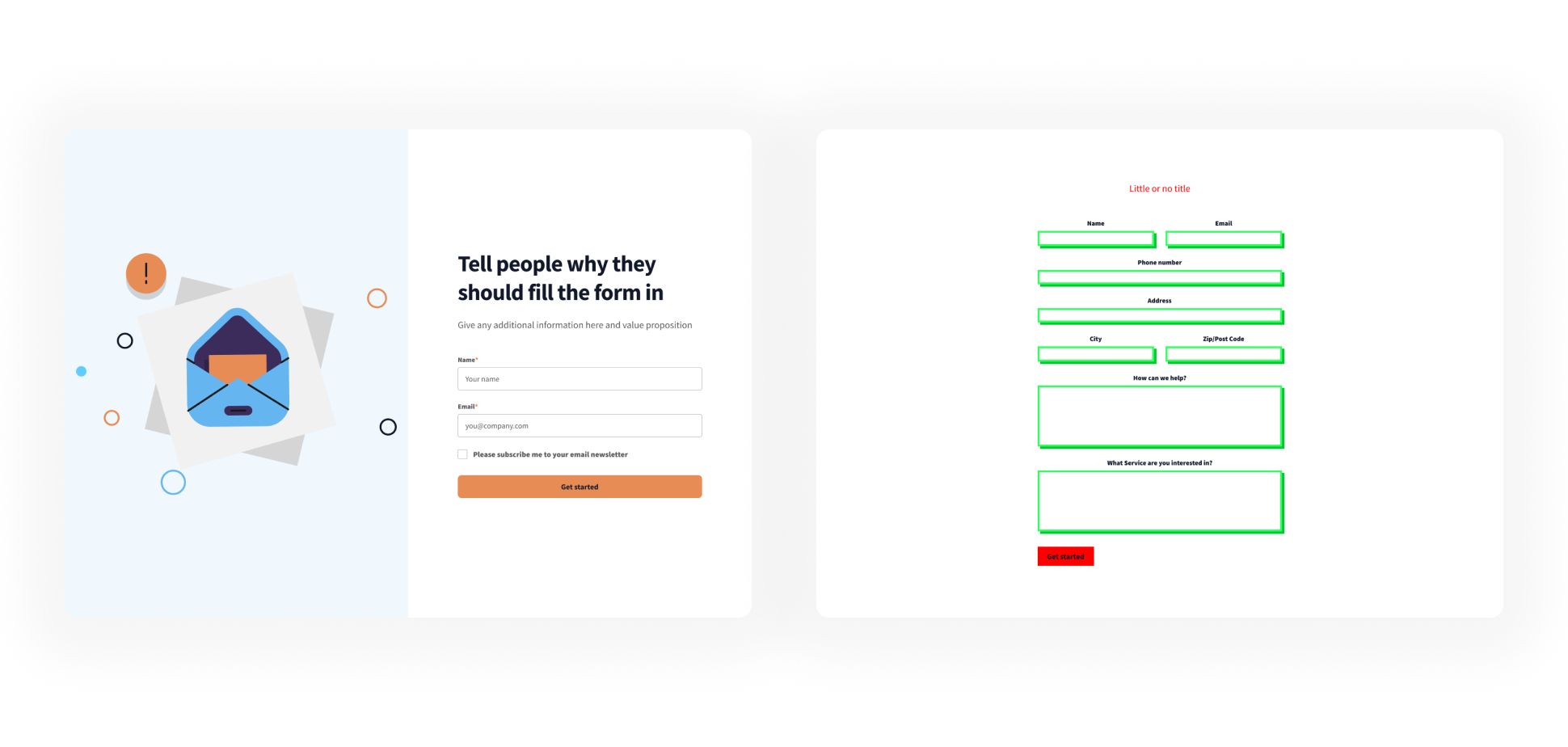
The good example form (on the left) is short and easy to fill in. The bad example form (on the right) has too many fields for a landing page
Easy-to-fill-in form top tips:
- Include some introduction text above the form to tell people why they should fill it in
- If the form fill is optional, make sure there is a strong value proposition to persuade them to complete it
- Keep your form length to a minimum
- People particularly dislike having to share their phone numbers - consider if this is necessary or whether you can make that an optional field on the form
- Make it clear how you process their data in accordance with GDPR
- Include a tick box so they can opt-in to receive further marketing messages
- Keep it eye-catching. Forms are inherently boring, but this is the key to your page’s success, so don’t be afraid to make it stand out!
If you absolutely must have the form on another page, make sure there are clear buttons to take visitors there.
Then, once they arrive, try to keep the form and landing page visually similar so people don’t get discouraged from entering their information.
Body of the landing page
Once you’ve caught users' attention and made it clear how to convert, it’s time to show off what you’re actually offering.
The body of your landing page should include information for those who are interested enough to read more but aren’t yet convinced to part with their details.
Never assume they’ll scroll all the way down though! Keep things concise and skimmable.
Explanation about who you are and what you’re offering
The body of a landing page is the place to flex your writing muscles, crafting persuasive and benefits-focused copy.
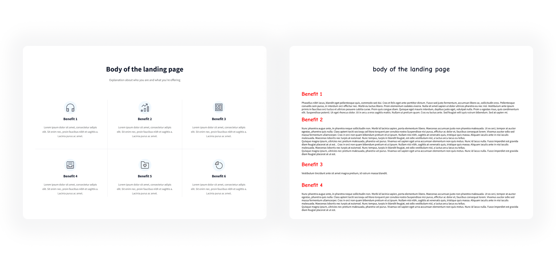
Try to keep explanations short and visual (left). Just because it’s body copy, it doesn’t mean you can be wordy (right)
Remember the target audience of the marketing campaign that is directing traffic to the website. Write for them rather than trying to appeal to absolutely everyone.
Don’t get bogged down in details, instead, we’d recommend sticking to either:
🅰️ Your offering’s benefits
What are your offering’s features and benefits? If you didn’t have room for what problems it solves in your heading you can write about them here. Examples:
- A one-off event with an agenda
- A product or service
Or:
🅱️ Why us?
This can be a good place to talk about your brand more - who you are, what you do and how it benefits people. Examples:
- A charity looking for general donations
- A destination selling holidays
Basically, evaluate how strong your stand-alone offering is = 🅰️ or whether your brand is the selling point = 🅱️ and write the copy on your page based on this.
There may be a slight crossover, but you should stay focussed on the conversion rather than explaining every detail about what you offer, who you are and what you do, as this will be too overwhelming for the reader.
Social proof
Anyone can say how great they are, but having social proof from other sources builds confidence in the claim.
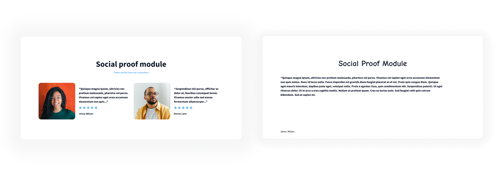
Keep social proof punchy (left) rather than too long. People are less likely to read long reviews (right).
Demonstrate your trustability from other sources by:
- Highlighting external brands that mention your business (newspapers, accreditations, awards that you’ve won etc).
- Using featured reviews relevant to the offering (ideally with a person’s face as this makes them more real)
- Strong star ratings and where they’re sourced from (make sure they’re accurate)
Frequent calls-to-action
Create calls-to-action (CTAs) throughout the landing page which link people to the form, so whenever someone is ready to convert they can easily do so.
If the potential customer needs more information, they can keep scrolling past a CTA, but they’ll eventually get to another.
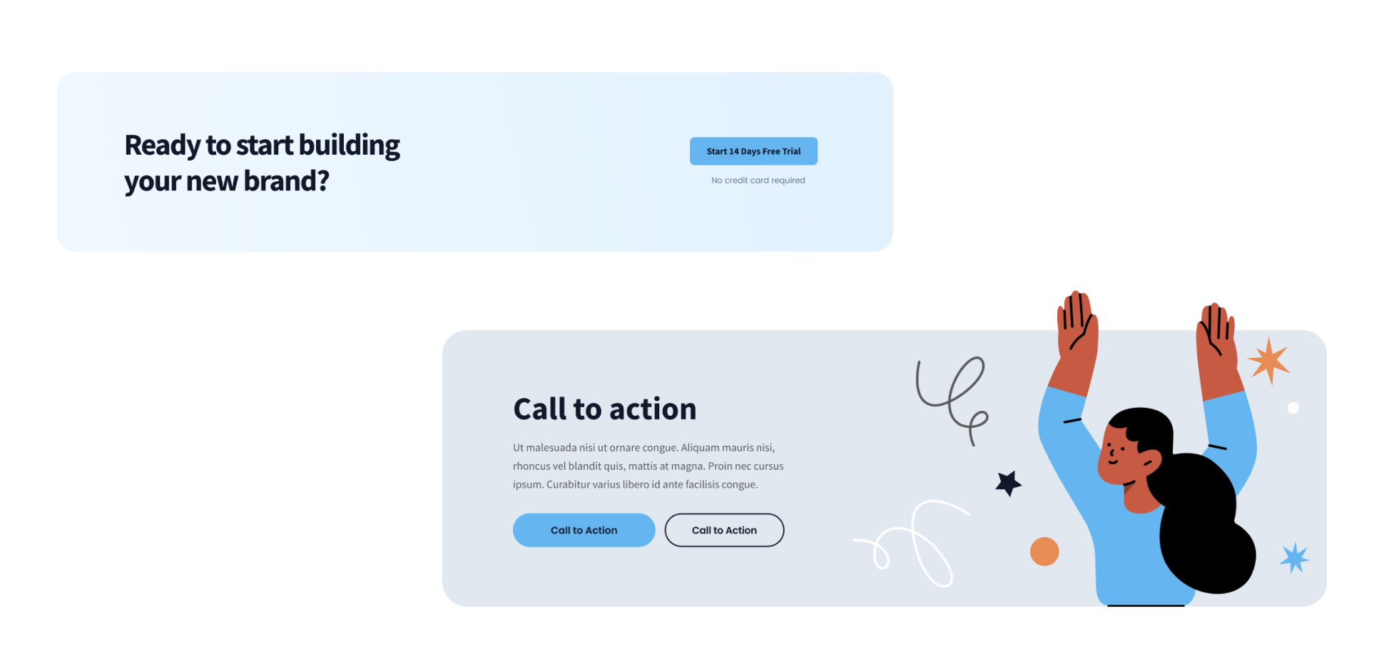
Two good examples of Call to Actions which can be used throughout the page
Try not to have too many buttons or links away from the landing page, as people may click these and then struggle to find their way back.
The exception is right at the bottom of the page, where there should be a strong CTA to get people to convert along with some other relevant resources. So even if a visitor isn’t convinced by your landing page they can do some further research on your website.
Optional landing page components
These components can work really well on certain landing pages, but aren’t suitable for all of them.
We’ve given some examples of where they can fit, but take these with a pinch of salt as every landing page is different.
Explanation of how it works
Useful for events, products or services
Show potential customers the specifics of the offering without getting too technical.
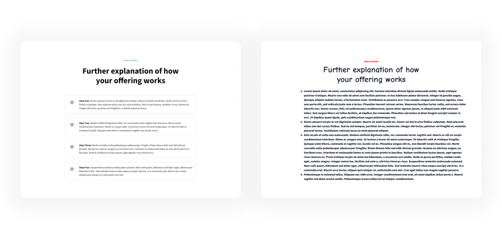
Ensure text is easy to skim (left) or it may look like a block of text on mobile (right)
Try to make things simple too, by answering the most important questions from below…
- For events - What can they do there? Is there a schedule? When does it start/finish?
- For products - How can they use it? What does it do? How long does it last?
- For services - How do they access it? What do they need to do? How does it work?
Frequently asked questions
Useful for products or services
There are still going to be things that people want to know which haven’t been answered in benefits-focused copy so far. FAQ’s answer these pain points factually and remove uncertainty.
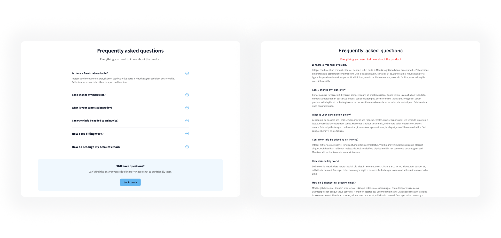
Consider using an accordion feature (left) to hide lengthy answers
Try to answer only the most important questions, the ones that will be relevant to people considering your offering.
For example, for an event, an FAQ about where the event is located is relevant. Whereas an FAQ with information about following events will be less appropriate for this conversion.
Remember that it’s important to keep the landing page as concise as possible.
If a lot of text is required, consider hiding the answers in an accordion block, so people can click on the questions they’re interested in.
Sense of urgency
Useful for events and special offers
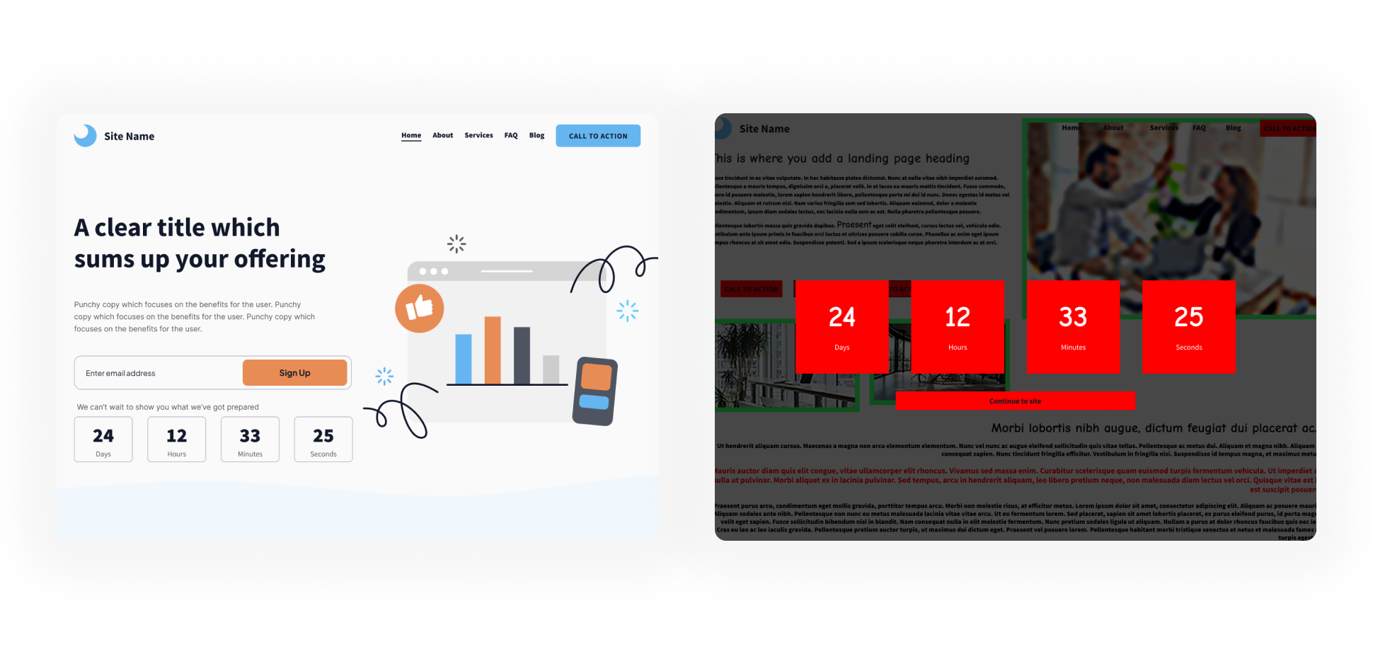
Make sure any urgency elements don’t appear spammy by overdoing them (right)
A good way to encourage people to fill in the form is by creating some sort of pressure or urgency. For example:
- A visual countdown (make sure it’s genuine and accurate, countdowns which always start at one hour don’t fool anyone!)
- An early-bird offer
- A freebie available only to the first X people who fill in the form
Depending on your brand, be careful with how you display the sense of urgency component on your page. If overdone, they can border on appearing spammy or fake, leaving a negative impression of your business and likely resulting in fewer conversions.
Competitive comparison chart
Useful for products or services
The goal of this section is to show your potential customer why your offering is the best option, especially when compared to other companies providing similar products or services.

Charts should be easy to understand at a glance (left) rather than too data-heavy (right)
Show off your features and benefits in comparison to your competitors, but make sure you stick to the facts and don’t over-exaggerate.
Don’t try to make other businesses look terrible as this would devalue your claim and avoid naming competitors specifically as this looks unprofessional.
You’re trying to show why you’re better.
Landing page component building blocks
Remember, your marketing campaign is only as effective as its landing page.
Following this article will give you the blocks to build a great page and nail those all-important conversions.
Don’t feel confined to this list though, there are plenty of other components that suit individual landing pages. Just remember to sprinkle some CTAs throughout!
Finally, once someone has converted make sure they’re not left in the dark:
- Track form fills to see which types of campaigns are bringing through those most likely to convert
- Set-up automated messages that are sent out to users that fill in the form so they know they have submitted it successfully
- Follow up promptly on the leads you’ve worked so hard to acquire.
Want to make life really easy? Let Bliss design your landing pages for you.
Or if you’re looking for more traffic to your website, check out our marketing services.
Articles and Blogs
Our blog gives you more of an insight into who Bliss are and what we’re up to. Check out our articles below.
View all articles