In the first of two articles on design, this week we are covering some 2020 design trends and three of Mark’s holy grail design tips. So, if you’ve ever fancied yourself having a creative streak, or are interested in what the websites of the future will be looking like, read on!
This isn’t the only article featuring our lovely members of staff:
- Head honcho/CEO, Jon Stutfield, presented on keeping your website looking and working smoothly to increase conversion rates
- Digital Marketing Manager, John-Paul Atley, answered questions in our first-ever podcast about marketing for this “difficult period”
- Paid Digital Manager, Brian, gave his experienced insight into paid marketing and also summed up his favourite free tools to use for paid marketing
- Or you can catch all the Bliss staff giving our best digital tips for working from home productively! Don’t worry, we cast no judgement for wearing pyjamas all-day
Top Design Trends
What makes a website look truly great?
When a website looks a little off or old-fashioned, it’s something a lot of us can pick up on. But fixing it to look professional and modern, or starting from a blank canvas to create something that looks the part, is a completely different ball game.
That’s why we asked Mark to round up some of his favourite design trends of right now. From fonts and colours to layouts, these are the cutting-edge elements which will make websites look like they belong in the roaring twenties!
PRO TIP: If you ever want to realise how little you know about design, ask your Creative Director about industry trends and be prepared to find a dictionary.
1. Asymmetry in websites
“I’ve always loved asymmetric layouts, particularly utilising bold geometric shapes to house User Interface. This seems to be getting broader traction of late.”
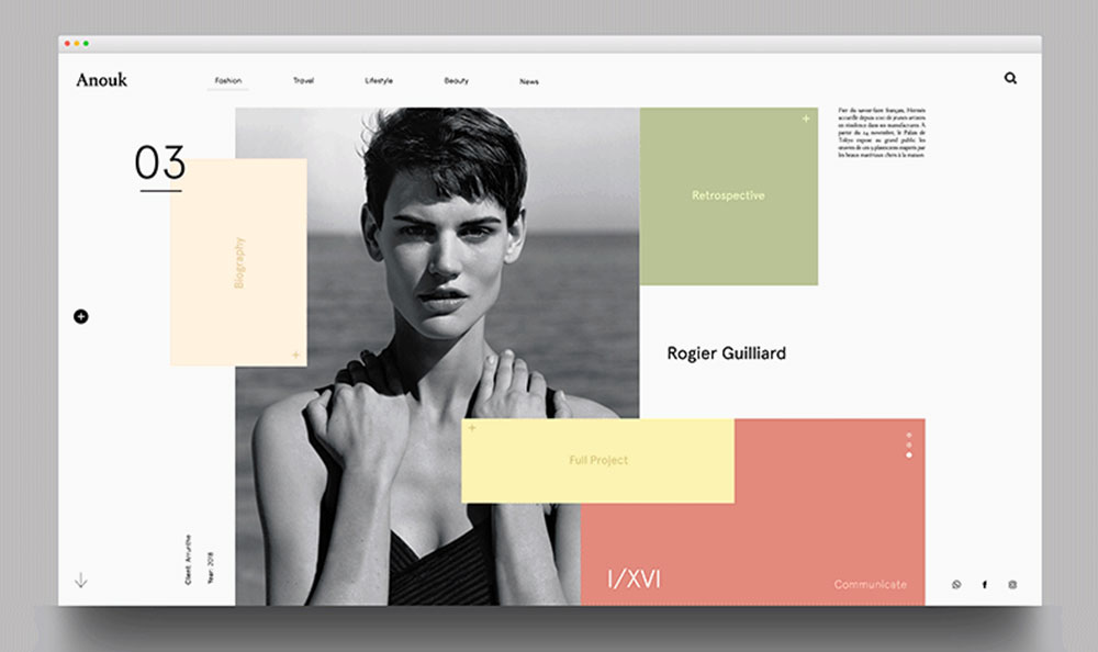 An example of an asymmetric website
Perhaps as a response to drag-and-drop block websites which (by definition) have to have standard layouts, asymmetric websites are often unique and appear purpose-built.
These websites demand users’ attention if they want to interact with them. They let shape and colour do the talking as well as text. Whilst this makes them not suited to every industry, they make an undeniably strong impression.
 One of Mark’s designs of asymmetric layouts and how they can shift to different screen sizes
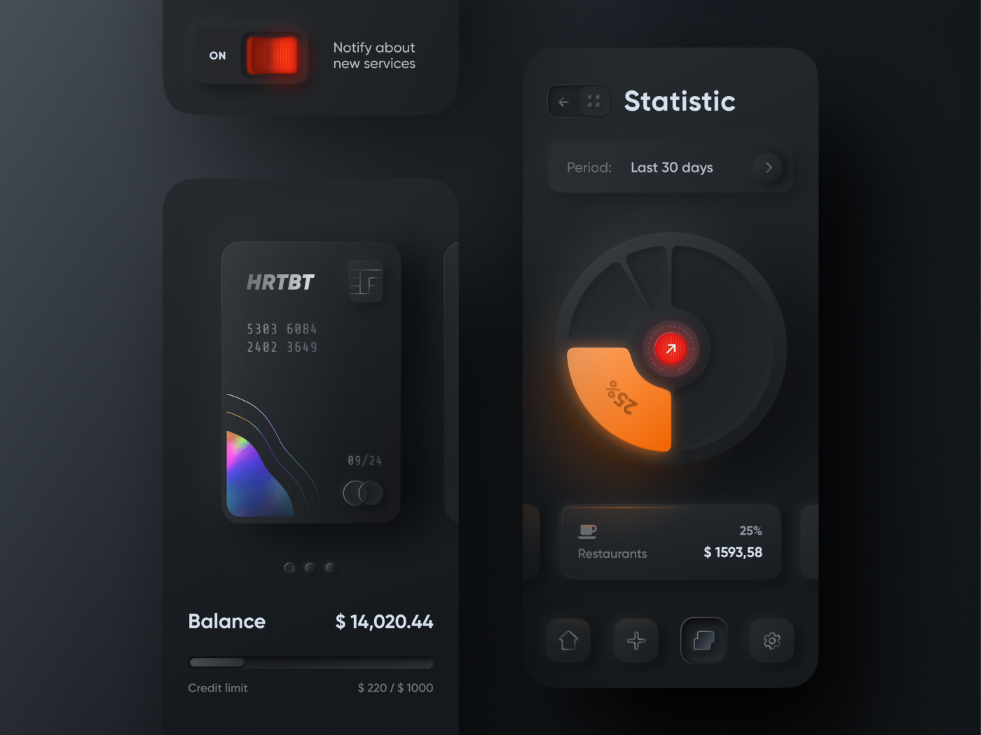
2. Neomorphism
“The rise of neomorphism is continuing, especially with the more bijou app designs that have the real-estate to really make the most of generous soft emboss effects etc.”
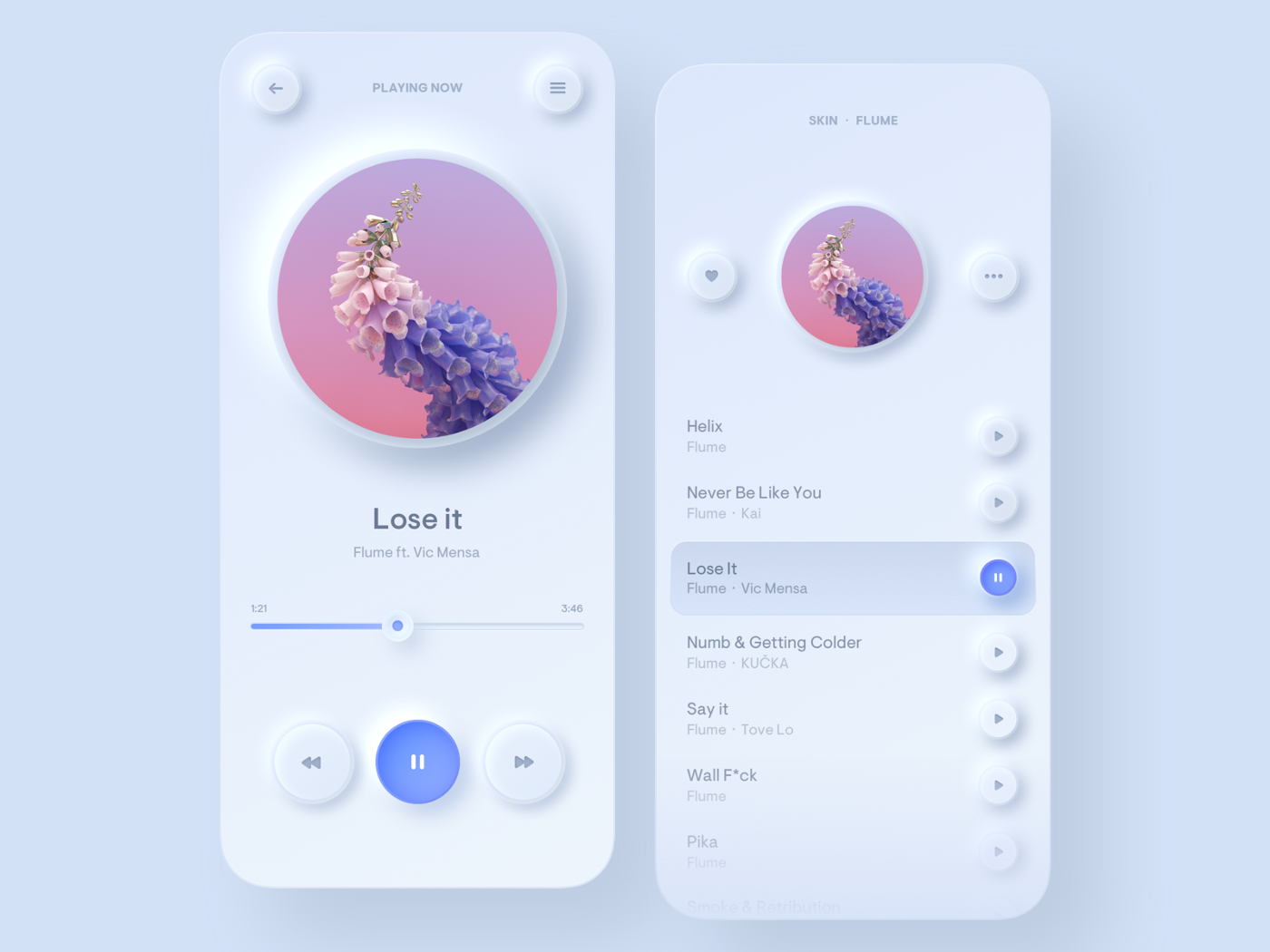 An example of neomorphic design
Neomorphism is a trend so new, spell-check doesn’t even recognise it. It can be described as imagery designed to look like a softly defined 3D-button or block, usually in just one colour (usually white).
As Mark mentioned, a full commitment to neomorphic elements (in apps, in particular) can really elevate the look of the interface. It’s a clean, fresh and undeniably modern trend, halfway between realistic-looking 3D buttons and flat, minimal or abstract designs which have been recently popular.
 Neomorphic designs are not only white, they can look striking in many colours
🛠 Free tool
Ever been concerned that your website doesn’t have enough neomorphic elements? Have a play at making some yourself at: neumorphism.io
3. Active states
“I love anything clickable to have an active state, whether it’s an in-your-face interaction for key promotions or something nice and subtle for more trivial elements, this also seems to be making its way to more and more digital products.”

Active states make interacting with websites a little more fun. Rather than the normal way of using a website, they make clicking a button or a pop-up a bit of a different experience for the user. Which in turn encourages interaction and engagement.
These microinteractions can be from small to large but always add a little personality to a website, communicating that brand even more so. Plus, smooth and fun interactions show the user that the website is working well, all building on their positive experience.
Again, an active state indicates a level of individuality to the website, as it has to be purposefully designed to work most effectively.
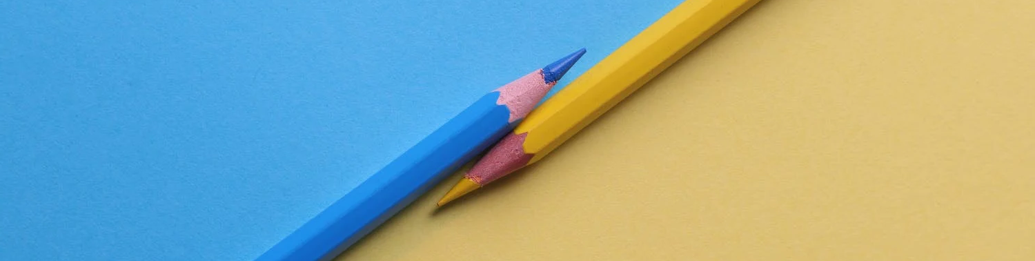
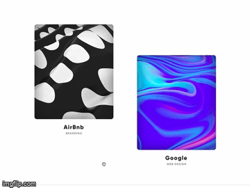
4. Multi-colourway gradients
“Keep an eye out for multi colourway gradients coming back on the scene”
These gradients can look really striking on a website. In industries where certain colours are particularly prevalent (such as in the holiday park industry, where brighter blues, greens and yellows are popular to represent the outdoors) coloured gradients can create a new look which stands out amongst competitors. Plus, they can be used as much or sparingly as possible - from a full background, to a tiny section of a logo - it’s a trend which could be incorporated into many websites.
PRO TIP: Keep gradients looking modern, rather than garish, by minimising how many highly saturated colours are used. (Although obviously, there are always exceptions!)
If you want more examples, then uigradients.com generates a different coloured gradient with every visit.
5. Large, circular fonts
“It’s nice to see that big, friendly circular fonts are here to stay. I like Cera or Circular.”
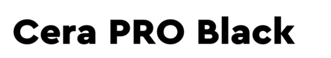
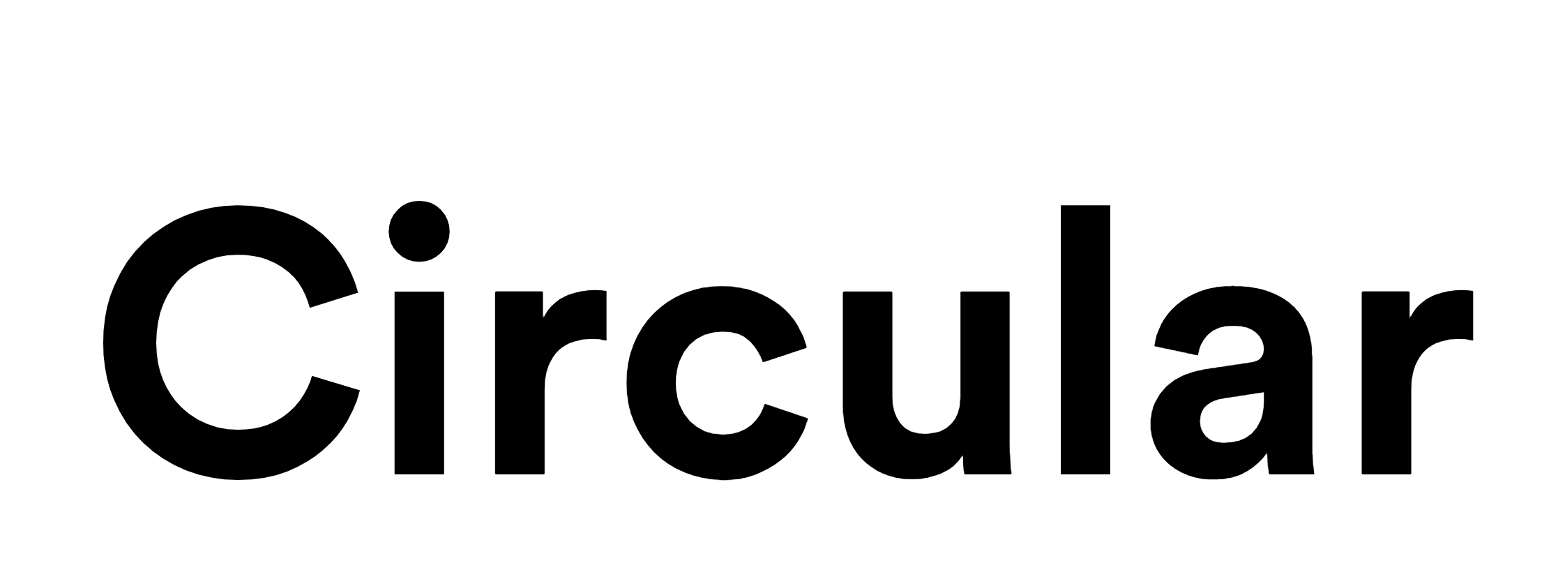
If you want for a new font for your website, consider using these sorts of fonts for a modern aesthetic. Unlike some of the other items on this list, a large circular font could fit into almost any brand or business.
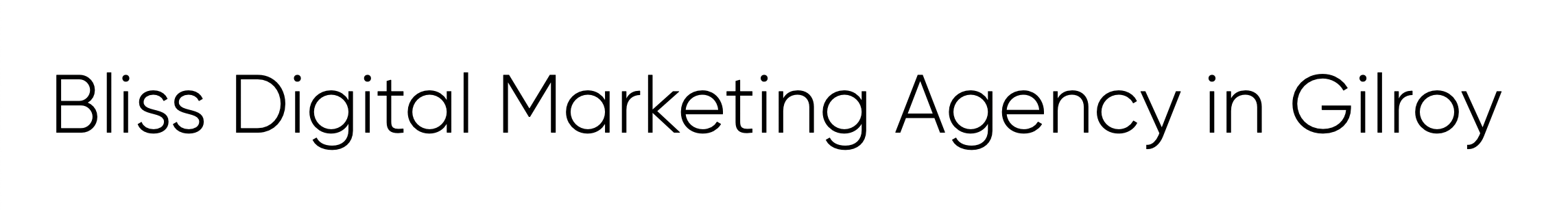
What’s great about these fonts is that they can look good, regardless of which weight you choose. Whether you prefer the heavier weights for headings (such as above) or lighter weights for body copy (below), they are versatile, easy-to-read and continually popular.
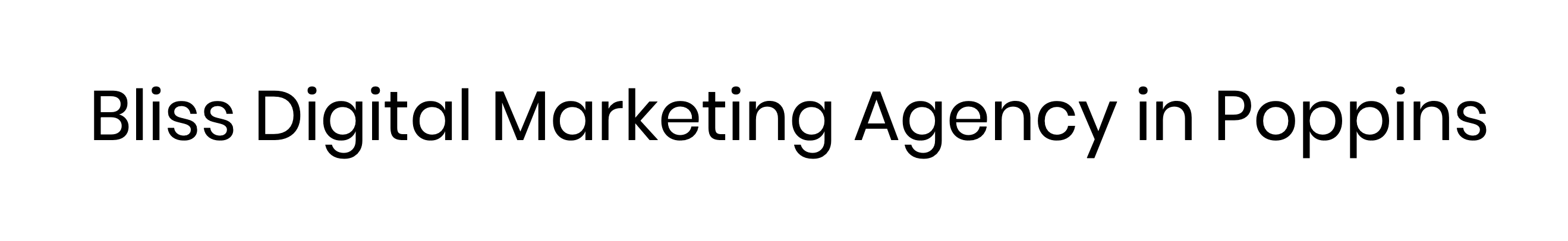
“If you're looking for a suitable Google Font freebie you can't beat Poppins!”
Another free option is the light version of ‘Gilroy’ which is the very best selling font on myfonts.com; showing the popularity of these styles.
Design Techniques for the Ages
Of course, the key to really great design is more than just squeezing in as many trends as possible on a webpage.
Whilst the above can keep your website looking modern, we also asked Mark for his top three evergreen tips to keep a website looking the part for design novices.
My three practical tips for design would be:
- If you think something isn’t quite right with your design, it needs more padding (the blank space around each element)!
- Be bold with your colour selections
- Pantone Cool Grey 10 is perfect for body copy, dark enough to read (WCAG compliant, even on a 10% black background) and light enough to allow charcoal or colourful headers to remain prominent. Don’t forget to test your own combinations to ensure good accessibility levels
Just as important is having the right attitude towards design:
- Strive for excellence, not perfection
- Take a long time to come to your creative beliefs but then stick to them rigidly
- Be nice to everyone*
Undeniably, having a great looking website is crucial to gaining the right attention, as it is often the first impression people have of your business. We hope you have enjoyed this foray into the world of design, guided by Mark. If you want to learn more about the design process Bliss uses for websites, click HERE. Or, for more emails like this, sign up for our email list HERE
* "until they’re rude to you and then crush them.” - Mark Hamilton, 2020
POPULAR, RELEVANT POSTS:
Online tools to boost your design skills
The ultimate guide to email marketing
Podcast on the importance of social-first marketing
Check out our full Content Hub for advice, best practice and ideas on how businesses can proceed with digital marketing during the Coronavirus period.
Articles and Blogs
Our blog gives you more of an insight into who Bliss are and what we’re up to. Check out our articles below.
View all articles

